We want to make a social media good for individuals and society! Help us by telling us what we can improve on!
Introducing Midflip’s newest version: Kickflip.
Kickflip has introduced a ton of new visual and system design changes. Midflip is currently working on:
Column is gone! Long live the new main page layout.
King-of-the-hill redesign. Its been a long road, but we are now getting feedback from new users that they understand the king-of-the-hill system quickly without prompting! New users are now quickly getting the advantages of midflip.
New post card layout - more intuitive and puts the user image first. Also easy visual depiction describing the difference between topic texts, edits, and posts.
Further feedback system has been taken out - It was too confusing for beginner users; we do however have plans to bring it back in a different simplified form later down the track.
New text editor - Our new text editor gives us a lot more flexibility to add new features. Already we have added mentions!
Simplification of the many-choice menu.
Easy follow / friend / message interaction path.
And lots more!!!
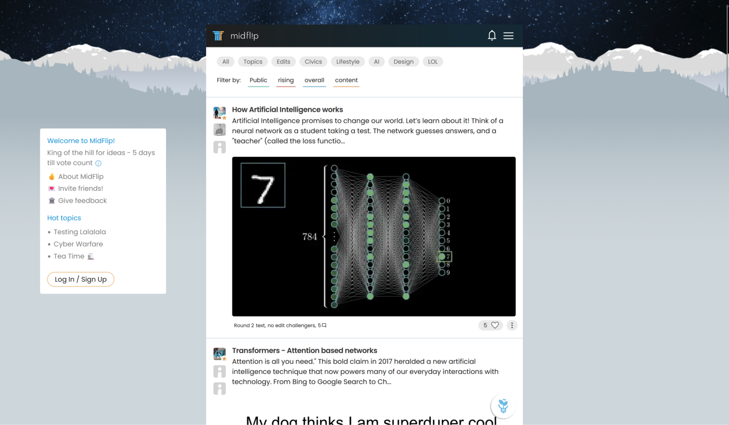
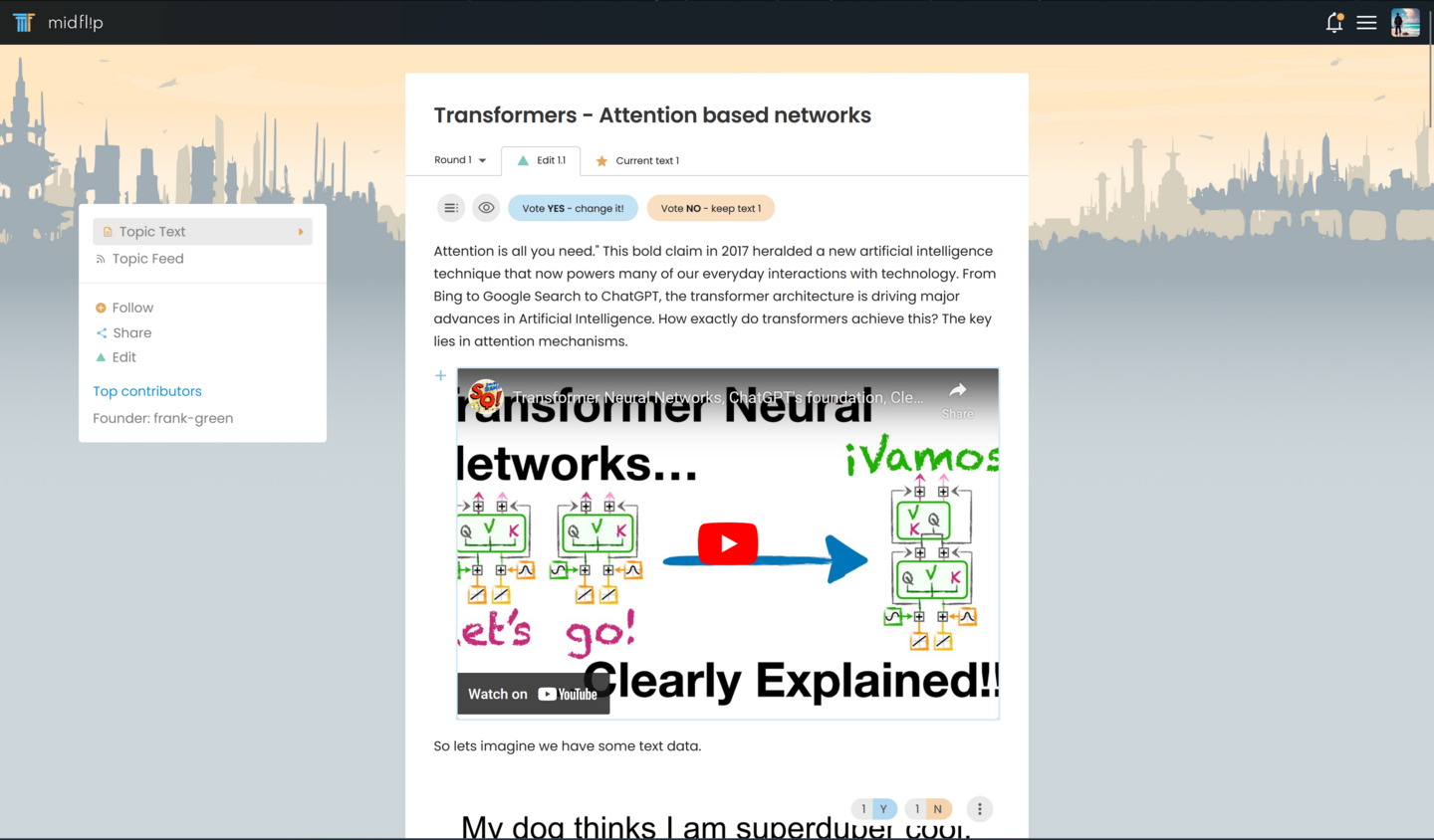
- New text editor, new post creation path.
- We have had feedback that it feels more like a blogging website, and that the social media aspect is not shining through. We are working on a new design that emphasizes the user behind the post/comment.
- Building our small group of users up, as to get more feedback.
Midflip is currently on version Ollie. Midflip's next version will be version Kickflip . There will be large visual changes so for the record we are recording changes here.
Ollie looks like this:
Midflip - version kickflip will change ALOT of the above design. For those following along, we are cutting a lot of complexity and simplifying. At the same time we are emphasizing the person who is posting and giving that person more customization options as to present themselves.
MidFlip changes fast - that is our best quality - the ability to pivot on a dime - Help us aim our changes towards your needs by providing feedback. Be brutal. Stick a knife into our front and twist. Design decisions (and ideas in general) should be put under fire and made to run the gauntlet.
Next Steps
We will be doing another push towards new users very soon. With that new influx, we hope to get further feedback as to keep refining! Lets build better online discourse.
Hot comments
about anything