King of the hill #1
at
MidFlip: Iterating in public.Submitted by
Joshon
9/26/2023.
It held the top position until it lost to an
editwritten by Josh (4 YES 0 NO).
King of the hill #1
at
MidFlip: Iterating in public.Submitted by
Joshon
9/26/2023.
It held the top position until it lost to an
editwritten by Josh (4 YES 0 NO).
Awesome stuff! Can't wait. P.s. I am still sometimes getting that error where the avatar icon shows up on top of stuff... when the expandable open section first loads on champ page.
I think that's a firefox thing devs! Don't see it on chrome.
Be mean. Tough love is required. Treat it like play-doe. Easy to make, easy to destroy. What can we rip out to make simpler? what can we polish harder?
I think the different post types and reactions are a good idea but too complicated for getting this ship off the ground.
We have been thinking similarly.
Also after last design round (versioning system) the bottom blub about how this is "champ 1 at blablabla" is no longer necessary.
agreed
I always forget to see comments - 1 extra click.
I don't know the best solution here because you want the topics to act like a hub for posts (i.e. a design where you can quickly jump to the post feed), BUT you also want it to act like a evolving text with comments (i.e. a design where the text is auto open and the comments come first).
Agreed, I have been prototyping different navigation systems... I have been trying to find one that also explains what is going on for newbies. Current prototype iteration below... still needs work to make look better.

More to explore:
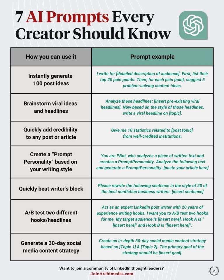
Most AI prompting for social media are automated t…

Everyone and their grandma is a prompt engineer ap…

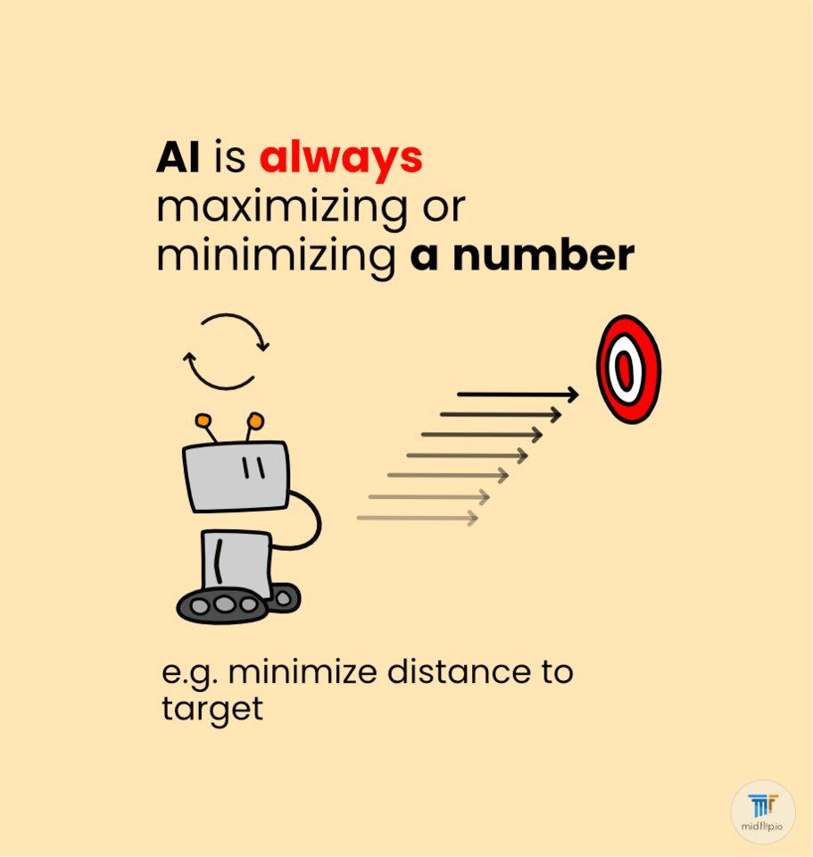
Artificial Intelligence is based on optimization.…

Hot comments
about anything